Create Dynamic Pages for a CMS using Directus and SvelteKit
Directus provides a headless CMS, which, when combined with SvelteKit, will streamline content management. This post covers how to combine the two to create dynamic pages for a content management system.
Before You Start
You will need:
- A new Directus project with admin access.
Set Up Your Directus Project
You'll need to configure CORS for this project. Update your docker-compose.yml file as follows:
CORS_ENABLED: "true"
CORS_ORIGIN: "http://localhost:5173"
CORS_CREDENTIALS: "true"
Apply the CMS Template
First, generate a static token for the admin user by going to the Users Directory. Choose the Administrative User or any user of your choice, scroll down to the Token field, and generate a static token. Copy the token and save it. Do not forget to save the user, or you will encounter an "Invalid token" error in the next step.
Next, use the Directus Template CLI to apply the CMS template for your project.
Open your terminal, run the following command, and follow the prompts:
npx directus-template-cli@latest apply
Choose Community templates, and select the CMS template. Fill in your Directus URL, and select Directus Access Token as the authentication method, filling in the token created earlier.
The Directus CLI command will make the required changes to Directus to add the CMS template.
Set Up Your SvelteKit Project
Initialize Your Project
To start building, you need to install SvelteKit and the Directus SDK. Run this command to install SvelteKit:
npx sv create dynamic-pages
When prompted, select SvelteKit minimal as the template. Do not add type checking, as this tutorial is implemented in JavaScript. Your output should look like this:
 Welcome to the Svelte CLI! (v0.6.16)
│
◇  Which template would you like?
│  SvelteKit minimal
│
◇  Add type checking with Typescript?
│  No
│
◆  Project created
│
◇  What would you like to add to your project? (use arrow keys / space bar)
│  none
│
◇  Which package manager do you want to install dependencies with?
│  npm
│
◆  Successfully installed dependencies
│
◇  Project next steps ─────────────────────────────────────────────────────╮
│                                                                          │
│  1: cd dynamic-pages                                                       │
│  2: git init && git add -A && git commit -m "Initial commit" (optional)  │
│  3: npm run dev -- --open
Afterward, cd into your project directory and install the Directus SDK by running this command:
npm install @directus/sdk
Configure the Directus SDK
To set up your Directus client with the authentication composable, create a file called directus.js inside the ./src/lib directory. Add the following code:
import { createDirectus, rest } from "@directus/sdk";

const client = createDirectus("http://localhost:8055").with(rest());

export default client;
Create the Posts Listing
If you check your Data Studio on Directus, you'll see there are existing posts that are installed from the template.
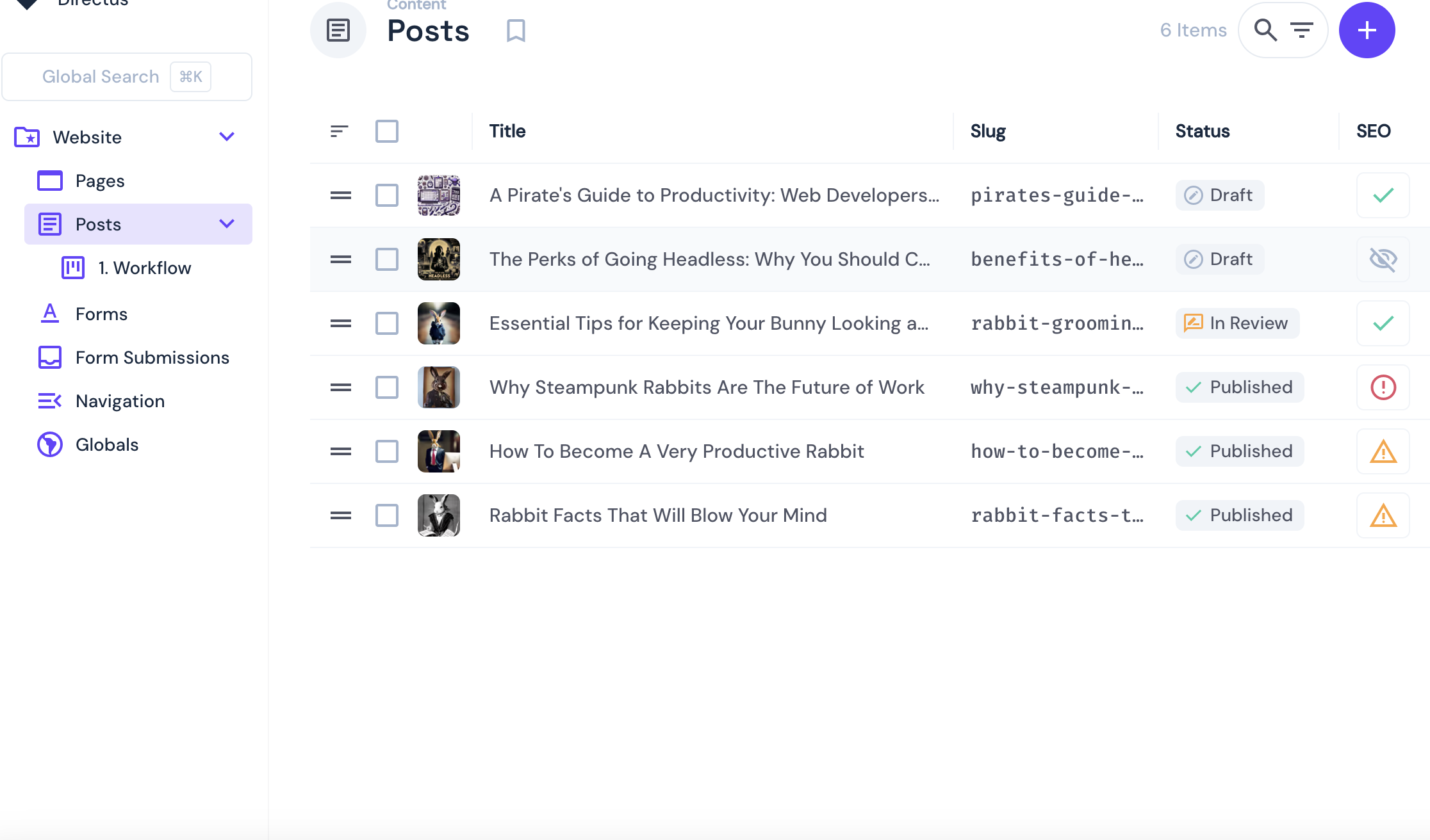
This will be enough for the tutorial.
You need to build a homepage that fetches and lists all blog posts from the Directus CMS. Only posts that have a published_at date will be shown.
Replace the code in the ./src/routes/+page.svelte file with the following:
<!-- src/routes/+page.svelte -->
<!-- src/routes/+page.svelte -->
<script>
 import { onMount } from "svelte";
 import client from "$lib/directus";
 import { readItems } from "@directus/sdk";

 let posts = [];
 let loading = true;

 onMount(async () => {
    try {
      posts = await client.request(
        readItems("posts", {
          fields: [
            "id",
            "title",
            "slug",
            "published_at",
            "image.title",
            "image.id",
            "description",
 ],
 filter: { published_at: { _empty: false } },
 sort: ["sort"],
 })
 );
 } catch (e) {
 console.error("Error fetching posts", e);
 } finally {
 loading = false;
 }
 });
</script>

<h1 class="page-title">Latest Posts</h1>

{#if loading}
 <div class="loading-container">
 <p>Loading...</p>
 </div>
{:else}
 <div class="posts-grid">
 {#each posts as post}
 <div class="post-card">
 {#if post.image}
 <div class="post-image-container">
 <img
 src="http://localhost:8055/assets/{post.image.id}"
 alt={post.image.title}
 class="post-thumbnail"
 />
 </div>
 {/if}
 <div class="post-content">
 <h2 class="post-title">{post.title}</h2>
 <p class="post-description">{post.description}</p>
 <a href="/posts/{post.slug}" class="read-more-link">Read more</a>
 </div>
 </div>
 {/each}
 </div>
{/if}

<style>
 .page-title {
 font-size: 2.5rem;
 margin-bottom: 2rem;
 color: #333;
 text-align: center;
 }

 .loading-container {
 display: flex;
 justify-content: center;
 padding: 3rem;
 font-size: 1.2rem;
 color: #666;
 }

 .posts-grid {
 display: grid;
 grid-template-columns: repeat(auto-fill, minmax(300px, 1fr));
 gap: 2rem;
 margin-top: 2rem;
 }

 .post-card {
 border-radius: 8px;
 overflow: hidden;
 box-shadow: 0 4px 10px rgba(0, 0, 0, 0.1);
 transition:
 transform 0.3s ease,
 box-shadow 0.3s ease;
 background-color: #fff;
 height: 100%;
 display: flex;
 flex-direction: column;
 }

 .post-card:hover {
 transform: translateY(-5px);
 box-shadow: 0 10px 20px rgba(0, 0, 0, 0.15);
 }

 .post-image-container {
 height: 200px;
 overflow: hidden;
 }

 .post-thumbnail {
 width: 100%;
 height: 100%;
 object-fit: cover;
 transition: transform 0.3s ease;
 }

 .post-card:hover .post-thumbnail {
 transform: scale(1.05);
 }

 .post-content {
 padding: 1.5rem;
 flex-grow: 1;
 display: flex;
 flex-direction: column;
 }

 .post-title {
 font-size: 1.3rem;
 margin-top: 0;
 margin-bottom: 0.8rem;
 color: #333;
 }

 .post-description {
 color: #666;
 margin-bottom: 1.5rem;
 line-height: 1.6;
 flex-grow: 1;
 }

 .read-more-link {
 display: inline-block;
 color: #4a90e2;
 text-decoration: none;
 font-weight: 600;
 transition: color 0.2s ease;
 margin-top: auto;
 }

 .read-more-link:hover {
 color: #1f5bb6;
 text-decoration: underline;
 }

 @media (max-width: 768px) {
 .posts-grid {
 grid-template-columns: 1fr;
 }
 }
</style>
This component uses onMount() to fetch published posts from Directus. Each post is displayed as a card with its title, image, and description.
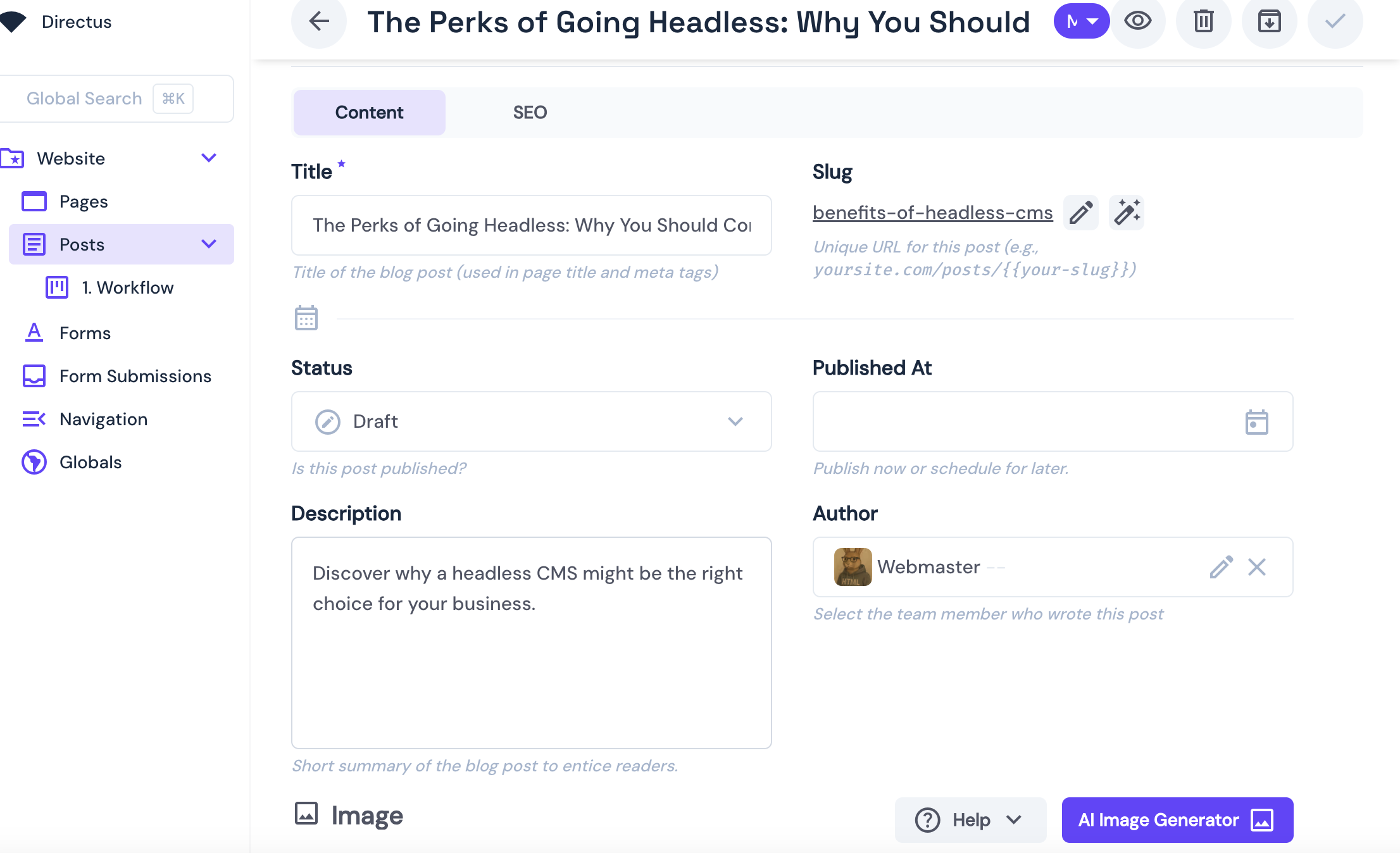
Create the Individual Posts` Pages
The next step is to create individual post pages, which have the following fields:
 Now, you need to build the individual post page. It will act as a detail page for each blog post using the post’s slug field. The individual post page will display details like the one below:
Create a subdirectory called [slug] inside the ./src/routes/posts/ directory, and inside it, create a '+page.svelte` file. Add the following code to it:
<script>
 import { onMount } from "svelte";
 import client from "$lib/directus";
 import { readItems } from "@directus/sdk";
 import { get } from "svelte/store";
 import { page } from "$app/stores";

 let post = null;
 let loading = true;

 onMount(async () => {
    const { slug } = get(page).params;

    try {
      const result = await client.request(
        readItems("posts", {
          filter: { slug: { _eq: slug } },
          fields: [
            "id",
            "title",
            "slug",
            "author",
            "published_at",
            "image.title",
            "image.id",
            "description",
            "content",
            "seo",
 ],
 limit: 1,
 })
 );

 post = result[0];
 } catch (error) {
 console.error("Error fetching post:", error);
 } finally {
 loading = false;
 }
 });
</script>

{#if loading}
 <div class="loading-container">
 <p>Loading post...</p>
 </div>
{:else if post}
 <article class="post-container">
 {#if post.image}
 <div class="featured-image-container">
 <img
 src="http://localhost:8055/assets/{post.image.id}"
 alt={post.image.title}
 class="featured-image"
 />
 </div>
 {/if}

 <h1 class="post-title">{post.title}</h1>

 <div class="post-meta">
 {#if post.author}<span class="author">By {post.author}</span>{/if}
 {#if post.published_at}
 <span class="date">
 {new Date(post.published_at).toLocaleDateString("en-US", {
 year: "numeric",
 month: "long",
 day: "numeric",
 })}
 </span>
 {/if}
 </div>

 <div class="post-description">
 <p>{post.description}</p>
 </div>

 <div class="post-content">
 {@html post.content}
 </div>
 </article>
{:else}
 <div class="not-found">
 <h1>Post not found</h1>
 <p>Sorry, the post you're looking for doesn't exist or has been removed.</p>
 <a href="/" class="home-link">Return to home</a>
 </div>
{/if}

<style>
 .loading-container {
 display: flex;
 justify-content: center;
 padding: 5rem 0;
 font-size: 1.2rem;
 color: #666;
 }

 .post-container {
 max-width: 800px;
 margin: 0 auto;
 padding: 2rem 1rem;
 }

 .featured-image-container {
 margin: -2rem -1rem 2rem;
 height: 400px;
 overflow: hidden;
 }

 .featured-image {
 width: 100%;
 height: 100%;
 object-fit: cover;
 }

 .post-title {
 font-size: 2.5rem;
 line-height: 1.2;
 margin-bottom: 1rem;
 color: #222;
 }

 .post-meta {
 display: flex;
 gap: 1rem;
 color: #666;
 margin-bottom: 2rem;
 font-size: 0.95rem;
 }

 .author {
 font-weight: 500;
 }

 .date::before {
 content: "•";
 margin-right: 1rem;
 }

 .post-description {
 font-size: 1.2rem;
 line-height: 1.6;
 color: #444;
 margin-bottom: 2rem;
 font-style: italic;
 border-left: 4px solid #eaeaea;
 padding-left: 1rem;
 }

 .post-content {
 font-size: 1.1rem;
 line-height: 1.8;
 color: #333;
 }

 .post-content :global(h2) {
 margin-top: 2rem;
 margin-bottom: 1rem;
 font-size: 1.8rem;
 color: #222;
 }

 .post-content :global(h3) {
 margin-top: 1.8rem;
 margin-bottom: 0.8rem;
 font-size: 1.5rem;
 color: #333;
 }

 .post-content :global(p) {
 margin-bottom: 1.5rem;
 }

 .post-content :global(img) {
 max-width: 100%;
 height: auto;
 margin: 2rem 0;
 border-radius: 4px;
 }

 .post-content :global(a) {
 color: #4a90e2;
 text-decoration: underline;
 }

 .post-content :global(blockquote) {
 border-left: 4px solid #4a90e2;
 padding-left: 1rem;
 font-style: italic;
 color: #555;
 margin: 2rem 0;
 }

 .not-found {
 text-align: center;
 padding: 5rem 1rem;
 }

 .home-link {
 display: inline-block;
 margin-top: 1.5rem;
 padding: 0.6rem 1.5rem;
 background-color: #4a90e2;
 color: white;
 text-decoration: none;
 border-radius: 4px;
 font-weight: 500;
 transition: background-color 0.2s ease;
 }

 .home-link:hover {
 background-color: #1f5bb6;
 }

 @media (max-width: 768px) {
 .post-title {
 font-size: 2rem;
 }

 .featured-image-container {
 height: 250px;
 }
 }
</style>
Integrate the SEO Metadata
To ensure each post has proper SEO tags, metadata must be dynamically injected using SvelteKit’s <svelte:head>.
Still in src/routes/posts/[slug]/+page.svelte, add this right after your <script> block, and before any HTML rendering like {#if loading}.
<svelte:head>
  {#if post?.seo?.title}
    <title>{post.seo.title}</title>
  {:else if post?.title}
    <title>{post.title}</title>
  {/if}

  {#if post?.seo?.meta_description}
    <meta name="description" content={post.seo.meta_description} />
  {/if}
</svelte:head>
If the post includes an SEO title, that value is used as the page’s <title>. If not, it falls back to the regular post title. Likewise, if a meta_description is available in the SEO field, it gets injected as a <meta> tag for the page description.
Add Breadcrumbs
Breadcrumbs are a way to help users understand where they are in your site’s structure. They can help improve navigation, add contextual awareness, and boost SEO. To implement breadcrumbs, create a subdirectory called components inside the ./src/lib directory. Inside it, create a file called Breadcrumb.svelte. Add the following code:
<script>
  import { browser } from "$app/environment";
  export let breadcrumbs = [];
</script>

<nav aria-label="breadcrumb">
  <ol class="breadcrumbs">
    {#each breadcrumbs as link, i}
      <li class="breadcrumb-item">
        {#if browser && link.href === window.location.pathname}
          <span class="current">{link.text}</span>
        {:else if link.href}
          <a href={link.href}>{link.text}</a>
        {:else}
          <span>{link.text}</span>
        {/if}
      </li>
      {#if i < breadcrumbs.length - 1}
        <li class="breadcrumb-separator">/</li>
      {/if}
    {/each}
  </ol>
</nav>

<style>
  .breadcrumbs {
    display: flex;
    list-style: none;
    padding: 0;
    margin: 0;
    font-size: 0.9rem;
    flex-wrap: wrap;
    align-items: center;
    gap: 0.5rem;
  }

  .breadcrumb-item {
    display: inline-flex;
    align-items: center;
  }

  .breadcrumb-separator {
    margin: 0 0.5rem;
    color: #999;
  }

  .breadcrumbs a {
    color: #4a90e2;
    text-decoration: none;
    transition: color 0.2s ease;
  }

  .breadcrumbs a:hover {
    color: #1f5bb6;
    text-decoration: underline;
  }

  .current {
    color: #666;
    font-weight: 500;
  }
</style>
Now, you need to display it across pages. To do this, create a +layout.svelte file inside the ./src/routes directory. Add the following code:
<!-- src/routes/+layout.svelte -->
<script>
  import Breadcrumb from "$lib/components/Breadcrumb.svelte";
  import { page } from "$app/stores";
  import { derived } from "svelte/store";

  const breadcrumbs = derived(page, ($page) => {
    const crumbs = [];

    if ($page.url.pathname !== "/") {
      crumbs.push({ text: "Home", href: "/" });

      const segments = $page.url.pathname.split("/").filter(Boolean);
      let path = "";

      for (const segment of segments) {
        path += `/${segment}`;
        crumbs.push({
          text: segment === "posts" ? "Posts" : prettifySegment(segment),
          href: segment === "posts" ? null : path,
        });
      }
    }

    return crumbs;
  });

  function prettifySegment(segment) {
    return segment
      .replace(/-/g, " ") // replace dashes with spaces
      .replace(/\b\w/g, (l) => l.toUpperCase()); // capitalize each word
  }
</script>

<div class="site-container">
  <header class="site-header">
    <div class="header-content">
      <a href="/" class="site-logo">Directus Blog</a>
      <Breadcrumb breadcrumbs={$breadcrumbs} />
    </div>
  </header>

  <main class="site-main">
    <slot />
  </main>

  <footer class="site-footer">
    <div class="footer-content">
      <p>© {new Date().getFullYear()} — Built with Directus & SvelteKit</p>
    </div>
  </footer>
</div>

<style>
  :global(body) {
    margin: 0;
    padding: 0;
    font-family: -apple-system, BlinkMacSystemFont, "Segoe UI", Roboto, Oxygen,
      Ubuntu, Cantarell, "Open Sans", "Helvetica Neue", sans-serif;
    background-color: #f8f9fa;
    color: #333;
    line-height: 1.6;
  }

  :global(*) {
    box-sizing: border-box;
  }

  .site-container {
    min-height: 100vh;
    display: flex;
    flex-direction: column;
  }

  .site-header {
    background-color: white;
    box-shadow: 0 2px 8px rgba(0, 0, 0, 0.08);
    padding: 1rem 0;
    position: sticky;
    top: 0;
    z-index: 10;
  }

  .header-content {
    max-width: 1200px;
    margin: 0 auto;
    padding: 0 1rem;
    display: flex;
    flex-direction: column;
    gap: 0.75rem;
  }

  .site-logo {
    font-size: 1.8rem;
    font-weight: 700;
    color: #333;
    text-decoration: none;
    transition: color 0.2s ease;
  }

  .site-logo:hover {
    color: #4a90e2;
  }

  .site-main {
    flex-grow: 1;
    max-width: 1200px;
    width: 100%;
    margin: 0 auto;
    padding: 2rem 1rem;
  }

  .site-footer {
    background-color: #f1f2f3;
    border-top: 1px solid #eaeaea;
    padding: 2rem 0;
    margin-top: auto;
  }

  .footer-content {
    max-width: 1200px;
    margin: 0 auto;
    padding: 0 1rem;
    text-align: center;
    color: #666;
  }

  @media (min-width: 768px) {
    .header-content {
      flex-direction: row;
      justify-content: space-between;
      align-items: center;
    }
  }
</style>
Test the application
To test the application, run this command:
npm run dev
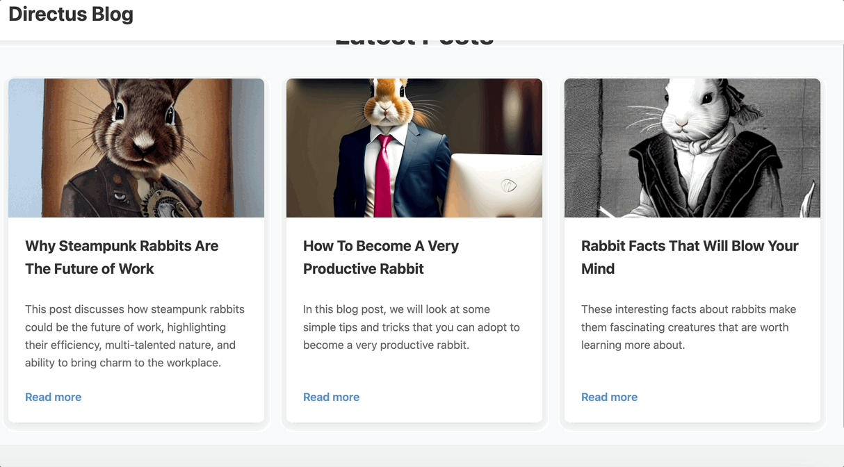
Afterward, open http://localhost:5173/ in your browser. You should see a homepage displayed containing blog posts. You can click on any of them:
Conclusion
In this tutorial, you built a dynamic CMS-powered blog using Directus and SvelteKit. Directus gives you a clean, API-first way to manage content without locking you into a specific frontend. Combined with SvelteKit, you get full control over how content is fetched, rendered, and optimized.